Gradient
Css Gradient
Css Gradient let you display smooth transitions between two or more specified colors.
There are three types of css gradient Which are as follows:
- -linear-gradient
- -radial-gradient
- -conic-gradient
linear-gradient
In a linear gradient, the colors flow in a given direction, for example from left to right, top to bottom, or any angle you choose
Syntax
background : linear-gradient(direction, color-stop1, color-stop2, ...) ;
Example
div {
background : linear-gradient(to right, red , yellow,blue) ;
width : 100% ;
height : 200px ;
}
In the above code we set the direction of the gradient to right which means the gradient flow will start from right to left.
Result
linear-gradient
radial-gradient
To create a radial gradient you must also define at least two color stops.
A radial gradient is defined by its center.By default, shape is ellipse, size is farthest-corner, and position is center.
Syntax
background : radial-gradient(shape size at position, start-color, ..., last-color) ;
Example
div {
background : radial-gradient(red, yellow, green) ;
width : 100% ;
height : 200px ;
}
Result
radial-gradient
conic-gradient
A conic gradient is a gradient with color transitions rotated around a center point.
To create a conic gradient you must define at least two colors.
Syntax
background : conic-gradient([from angle] [at position,] color [degree], color [degree], ...);s ;
Example
div {
background : conic-gradient(blue 45deg, green 90deg, violet 210deg) ;
width : 200px ;
height : 200px ;
}
In the above code we give each color a degree.
Result
conic-gradient
Flexbox
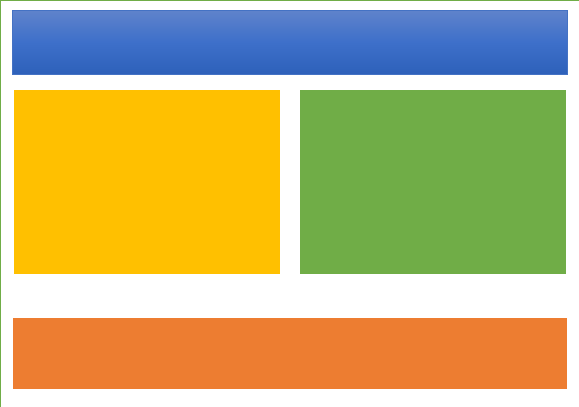
Flexbox Flexbox is a layout method for arranging items in rows or columns. Flexbox is short for the Flexible Box Layout module.
Flexbox makes it easier to design a flexible responsive layout structure, without using float or positioning.
Example of flex-box
Box 1
Box 2
Box 3
Flexbox component:
- Flexbox container:- the parent (container) < div> element
- Flexbox item:- the items inside the container < div>
Flexbox container
A flex container is an Html element whose display property's value is flex or inline-flex. The flex container becomes flexible by setting the display property to flex.
Syntax
display : flex ;
This flexbox container can take some css properties which are as follows:
- flex-direction :- specifies the display-direction of flex items in a container
- flex-wrap :- specifies whether the flex items should wrap or not.
- flex-flow :- is the shortcut property of setting both flex-wrap and flex-direction
- justify-content :- is used to align the flex items when they do not use all available space on the main-axis (horizontally).
- align-items :- is used to align the flex items when they do not use all available space on the cross-axis (vertically).
- align-content :- property is used to align the flex lines.
flex-direction
The flex-direction property specifies the display-direction of flex items in the flex container.
The flex-direction property can have one of the following values:
- row :-The row value is the default value, and it displays the flex items horizontally (from left to right).
- column :-The column value displays the flex items vertically (from top to bottom).
- row-reverse :-The row-reverse value displays the flex items horizontally (but from right to left)
- column-reverse :-The column-reverse value displays the flex items vertically (but from bottom to top).
flex row example
.div {
display : flex ;
flex-direction : row ;
}
Result
Box 1
Box 2
Box 3
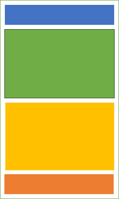
flex column example
.div {
display : flex ;
flex-direction : column ;
}
Result
Box 1
Box 2
Box 3
flex-wrap
The flex-wrap property specifies whether the flex items should wrap or not, if there is not enough room for them on one flex line.
The flex-wrap property can have one of the following values:
- wrap :-value specifies that the flex items will wrap if necessary
- nowrap :-value specifies that the flex items will not wrap (this is default):
- wrap-reverse :-value specifies that the flex items will wrap if necessary, in reverse order
flex wrap example
.div {
display : flex ;
flex-wrap : wrap ;
}
Result
Box 1
Box 2
Box 3
Box 4
Box 5
Box 6
Box 7
Box 8
in this above result when the available sapce is not enough it doesn't breaks to the next line.
flex nowrap example
.div {
display : flex ;
flex-wrap : nowrap ;
}
Result
Box 1
Box 2
Box 3
Box 4
Box 5
Box 6
Box 7
Box 8
in this above result when the available sapce is not enough it breaks to the next line.
flex wrap-reverse example
.div {
display : flex ;
flex-wrap : wrap-reverse ;
}
Result
Box 1
Box 2
Box 3
Box 4
Box 5
Box 6
Box 7
Box 8
in this above result when the available sapce is not enough it breaks to the next line but in reverse form .
Flexbox items
The direct child elements of a flex container automatically becomes flex items.
Box 1
Box 2
Box 3
In the above flexbox container the 3 boxes are the flexbox items.
flexbox item has some properties which are as follows:
- flex-grow :- specifies how much a flex item will grow relative to the rest of the flex items.
- flex-shrink :- specifies how much a flex item will shrink relative to the rest of the flex items.
- align-self :- specifies the alignment for the selected item inside the flexible container.
Grid
Grid The Grid Layout Module offers a grid-based layout system, with rows and columns. The Grid Layout Module allows developers to easily create complex web layouts.
Css Grid components
- Grid container:- the parent (container) < div> element
- Grid item:- the items inside the container < div>
Grid container
The css grid container is a type of container containing a number of cells laid out in rows and columns.
grid contaiiner has some css property which are:
- grid-template-rows :- specifies the number (and the heights) of the rows in a grid layout
- grid-template-columns :- defines the number of columns in your grid layout, and it can define the width of each column.
Grid Item
Every grid container contains one or more gride item
Grid items are the child elements in a grid container. By default, a container has one grid item for each grid cell. The number of cells a grid item occupies can be controlled with CSS.
Grid item properties
- The grid-column-start :- property specifies where to start a grid item.
- The grid-columns-end :- property specifies where to end a grid item.
Transforms
The Transforms property applies a 2D or 3D transformation to an element. This property allows you to rotate, scale, move, skew, etc., elements.
Syntax
transform : none|transform-functions|initial|inherit ;
transform values
- scale :-Scales an element horizontally and vertically (width and height)
- rotate :-Defines a 2D rotation, the angle is specified in the parameter
- skew :-Defines a 2D skew transformation along the X- and the Y-axis
- translate :-Defines a 2D translation
- matrix :-Defines a 2D transformation, using a matrix of six values
- perspective :-Defines a perspective view for a 3D transformed element
Transition
Transition is the process of changing the state of an element from one condition to another.
Syntax
transition : property duration timing-function delay|initial|inherit ;
transition properties:
- transition-property
- transition-delay
- transition-duration
transition-property
property specifies the name of the CSS property the transition effect is for (the transition effect will start when the specified CSS property changes).
Transition effects are mostly in action when user hover over an element.
transition-delay
The transition-delay property specifies when the transition effect will start.
The transition-delay value is defined in seconds (s) or milliseconds (ms).
transition effect without transition-delay
.div {
width : 150px ;
height : 150px ;
background-color: blue ;
}
.div:hover {
width : 350px ;
}
Result
In the above result we did not apply any transition-delay effect that is why it function immediately.
transition effect with transition-delay
.div {
width : 150px ;
height : 150px ;
background-color: blue ;
transition-delay: 2s ;
}
.div:hover {
width : 350px ;
}
Result
In the above result if you observe the transition-delay effect if you hover over the blue container it do not function untill after 2 seconds that means we apply 2 seconds value to the transition-delay property.
transition-duration
The transition-duration property specifies how many seconds (s) or milliseconds (ms) a transition effect takes to complete.
transition effect without transition-duration
.div {
width : 150px ;
height : 150px ;
background-color: blue ;
}
.div:hover {
width : 350px ;
}
Result
In above result we did not apply any transition-duration at all.
transition effect with transition-duration
.div {
width : 150px ;
height : 150px ;
background-color: blue ;
transition-duration: 2s ;
}
.div:hover {
width : 350px ;
}
Result
In the above result we apply transition-duration of 2 seconds which set the duration of the transition effect.
Animation
Animation
Animation is the process of changing the state of an element from one condition to another.
Css allows developers to apply animations to HTML element without usingg javascript.
An animation lets an element gradually change from one style to another.
Animation properties:
- @keyframes
- animation-name
- animation-duration
- animation-delay
- animation-iteration-count
- animation
@keyframes
To change the style of an element using css animation you must specify the @keyframes rule.
After you specify css style inside the @keyframes rule, the animation will gradually change from the current style to the new style at certain times.
An example animation with @keyframes:
.div {
width : 150px ;
height : 150px ;
background-color: red ;
animation-name: animation ;
animation-duration: 2s ;
}
@keyframes animation {
from {background-color : red; }
to {background-color : yellow; }
}
Result
.div {
width : 150px ;
height : 150px ;
background-color: red ;
animation-name: animation ;
animation-duration: 2s ;
}
@keyframes animation {
from {background-color : red; }
to {background-color : yellow; }
}
Result
In this above animation we change the element style in @keyframes, we change the background-color from red to yellow
animation-name
The animation-name property specifies a name for the @keyframes animation.
Syntax
animation-name: animation ;
animation-duration
The animation-duration property defines how long an animation should take to complete one cycle.
If the animation-duration property is not specified, no animation will occur, because the default value is 0s (0 seconds).
Syntax
animation-duration : duration seconds ;
Note : Always specify the animation-duration property, otherwise the duration is 0, and will never be played.
animation-delay
The animation-delay property specifies a delay for the start of an animation.
The animation-delay value is defined in seconds (s) or milliseconds (ms).s
Syntax
animation-delay : delay seconds ;
animation-iteration-count
The animation-iteration-count property specifies the number of times an animation should be played.
Syntax
animation-iteration-count : number|infinite|initial|inherit ;
animation
The animation property is a shorthand property for:
- animation-name
- animation-duration
- animation-delay
- animation-iteration-count
Syntax
animation : name duration timing-function delay iteration-count direction fill-mode play-state ;
Meadia queries/Responsive design
Responsive design
Responsive web design makes your web page look good on all devices.
Responsive web design uses only HTML and CSS.

It is called responsive web design when you use CSS and HTML to resize, hide, shrink, enlarge, or move the content to make it look good on any screen.
Media queries
Media queries allow you to apply CSS styles depending on a device's media type (such as print vs. screen) or other features or characteristics such as screen resolution or orientation
Media Type
- all :-Used for all media type devices
- print :-Used for print preview mode
- screen :-Used for computer screens, tablets, smart-phones etc.
Media features
- max-width :-Maximum width of the viewport
- min-width :-Minimum width of the viewport
- max-height :-Maximum height of the viewport
- min-height :-Minimum height of the viewport
For developers to be able to make a responsive web design the have to declare a @media rule.
The @media rule syntax
@media not|only mediatype and (media feature) and (media feature) {
Css code
}
Conclusion
The main purpose or main aim of the media querie and responsive web design is to make sure all webpages looks good on various screen sizes.